

Book Covers with Houses
Cover Lover

A Substacker was asking for feedback on a book cover she was designing that featured a streetscape. I pulled together these covers that I like, to provide my input. I find there are certain things that make these covers work – carefully chosen palette, a sense of movement, mischief, or attitude. Any sense of tension, suspicion or minor wrongdoing can be good.
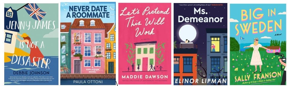
I have read all these except Let’s Pretend This Will Work, and enjoyed them.
Never Date A Roommate by Paula Ottoni – I like the people in the windows and the way there is an obvious main colour – pink. I like the way all the roofs are the same colour. The novel is set in Copenhagen, and you get a sense of the old world by the historic architecture.
Jenny James is Not a Disaster by Debbie Johnson – I love the sense of movement and tension in the way she’s trying to prevent the house from falling over the cliff. That is not a scene in the book - interestingly! She and her son arrive home in a storm as their house is falling. Obviously it’s too late to save it, but the image is a symbol of how she needs to take steps to save her own life.
Ms. Demeanor by Elinor Lipman – the misdemeanor in the story was having sex on the rooftop late at night not knowing they were being watched and photographed, so there is that tension in the picture, also the clean lines. I looked at this several times before realizing the windows are several different colours. In the story, she ends up under house arrest and has to make friends with the people in her building, kind of a forced proximity situation.
Let’s Pretend This Will Work by Maddie Dawson – the green windows work here, and I like the motion in the silhouettes, and the way the whole image is centred. Most of these have a sense of centredness except Jenny James
Big In Sweden by Sally Fransson – I like the sense of motion and attitude in the woman’s stance.
What do you think?